South Shore
Right away, we saw this home had fantastic bones. However, the homeowners had been living there for 20 years, and they were starting to understand the lack of quality in the materials. Originally, the home was designed by a developer, and had mostly builder-grade materials. At first, the homeowner was actually considering moving out! We saw the home for what it was: a huge opportunity to build something beautiful.
The first thing we examined was the center beam dividing the ceiling in the kitchen. The homeowner hadn’t noticed how distracting the beam was, but we knew we couldn’t allow this visual obtrusion to separate the room. We built in a coffered ceiling with a shiplap material, solid crown molding, and evenly spaced lighting to disguise the beam. This created the look of a sunken panel and also helped improve the acoustics within the room. This ended up being a major key to the project, affecting how we would approach the rest of the design.
The tile would set the tone for the design of the entire project, so it was important to get this just right. At first the homeowner was considering some artificial materials like porcelain, we guided them away from that. We recognized early on that the best approach was to use high-quality material and focus on fostering an authentic feel. We eventually found a 1/2 in thick tumbled antique limestone that looked like it should have been in the house for a century. This tile leading in from the front door to the kitchen set an entrancing, yet very authentic, atmosphere for the space.
To continue crafting the right atmosphere for the home, we expanded the entry into the family room to make it more inviting. There was a small circular window above the entry that didn’t fit the space or let in enough light. We replaced this with a large square window and added two more windows to fill out the aesthetic and open up the room with much more natural light. The end result was a beautiful, well lit, inviting entrance into the family room.
In the kitchen, we saw another huge opportunity to enhance the space. By opening up the main window, we allowed much more light into the room and opened up the beautiful view of the yard. We wanted to highlight the kitchen and connect it to the outside, and expanding the window did this beautifully.
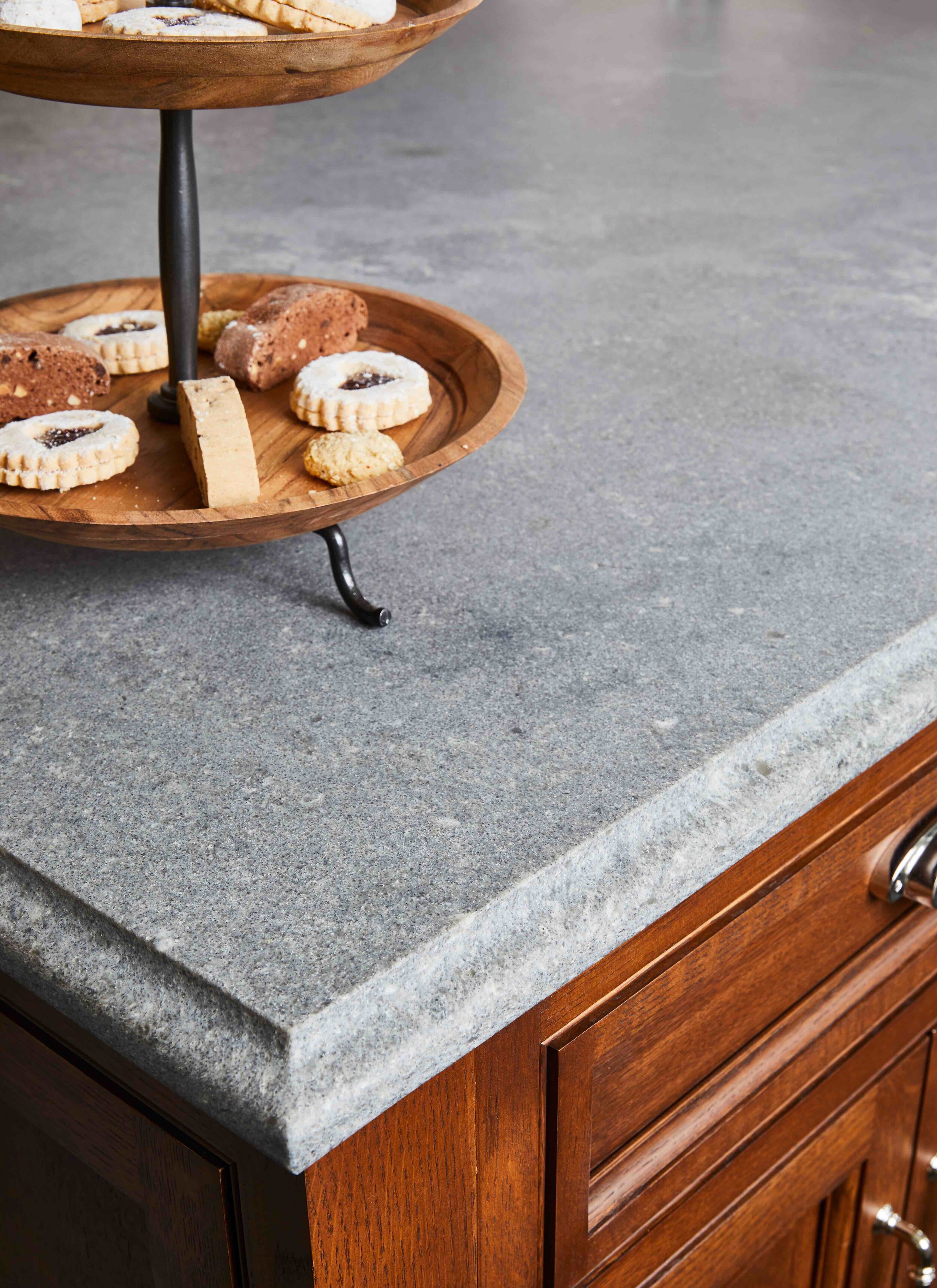
After bringing the kitchen out of the darkness, we needed to find the right balance. The space felt very cramped, especially with a table right next to an island. We crafted a beautiful 4 ft wide center island and incorporated a banquette, making for an efficient use of space and giving the kitchen a more natural flow. We used a very nice rifted oak with a Caesarstone rugged concrete countertop. We used this oak to guide the staining throughout the rest of the home to keep a consistent style. After resanding all the floors, we stained them to bring in the color tones from the kitchen.
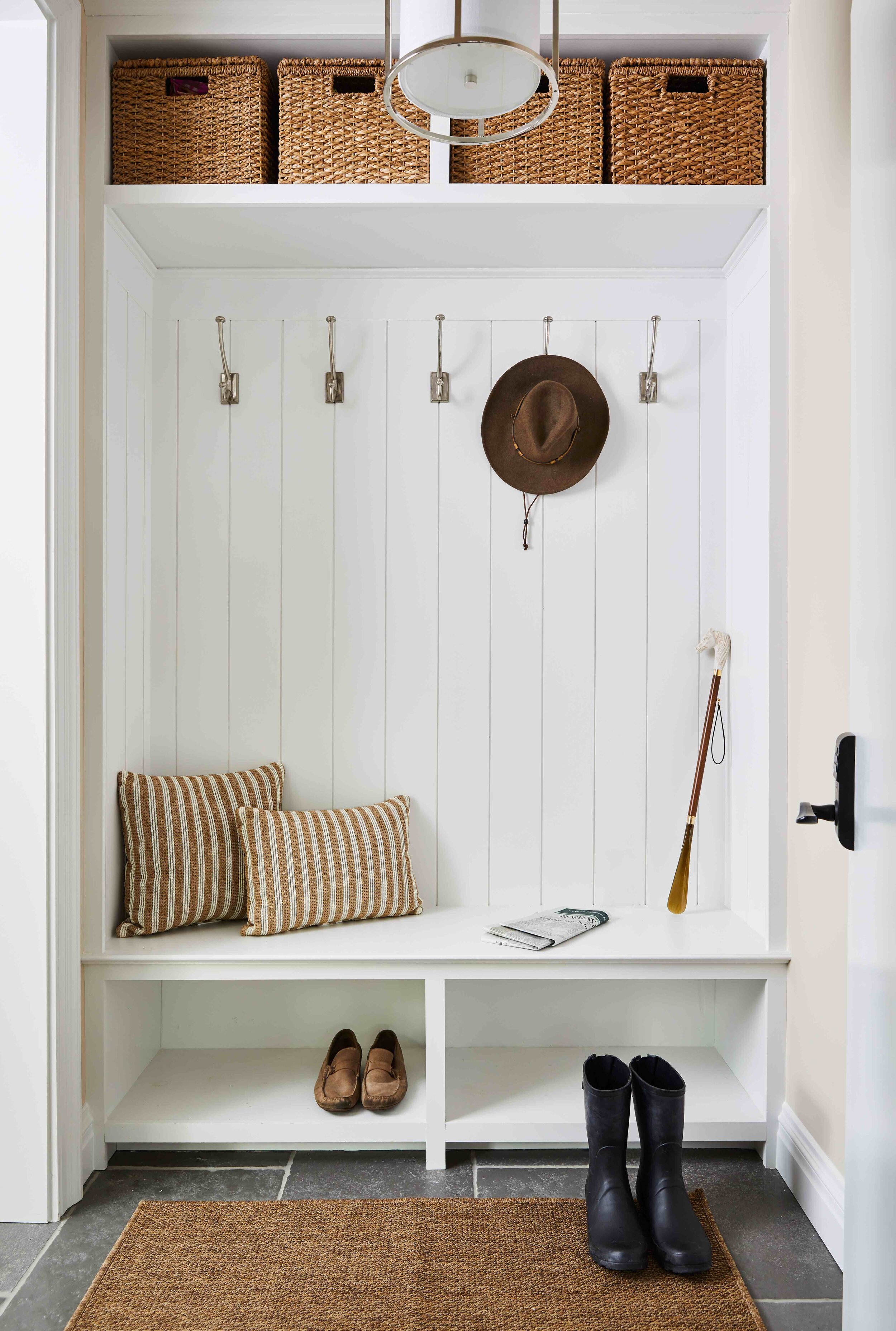
We didn’t want the inside of the home to compete with the outside, but the owners wanted to have more space, so we knew we needed some adjustments. Before, the kitchen door would just swing open into the kitchen from a closet in the garage, making the entrance feel very cramped and awkward. We ended up transforming this small closet into a functional mudroom leading from the garage into the kitchen. We created a platform going into the kitchen and positioned the door to swing into the mudroom, opening up space in the kitchen. By creating so much extra space in the kitchen and the entrance, we made entering through the garage a much more inviting and pleasant experience.
Then, we extended the back wall of the kitchen and centered the stove to create more space. In addition, we designed a custom hood, purposefully recessed to keep from breaking up the kitchen or distracting from the rest of the space. We also installed a magic corner for even more storage access without taking up extra space or having to reach far back.
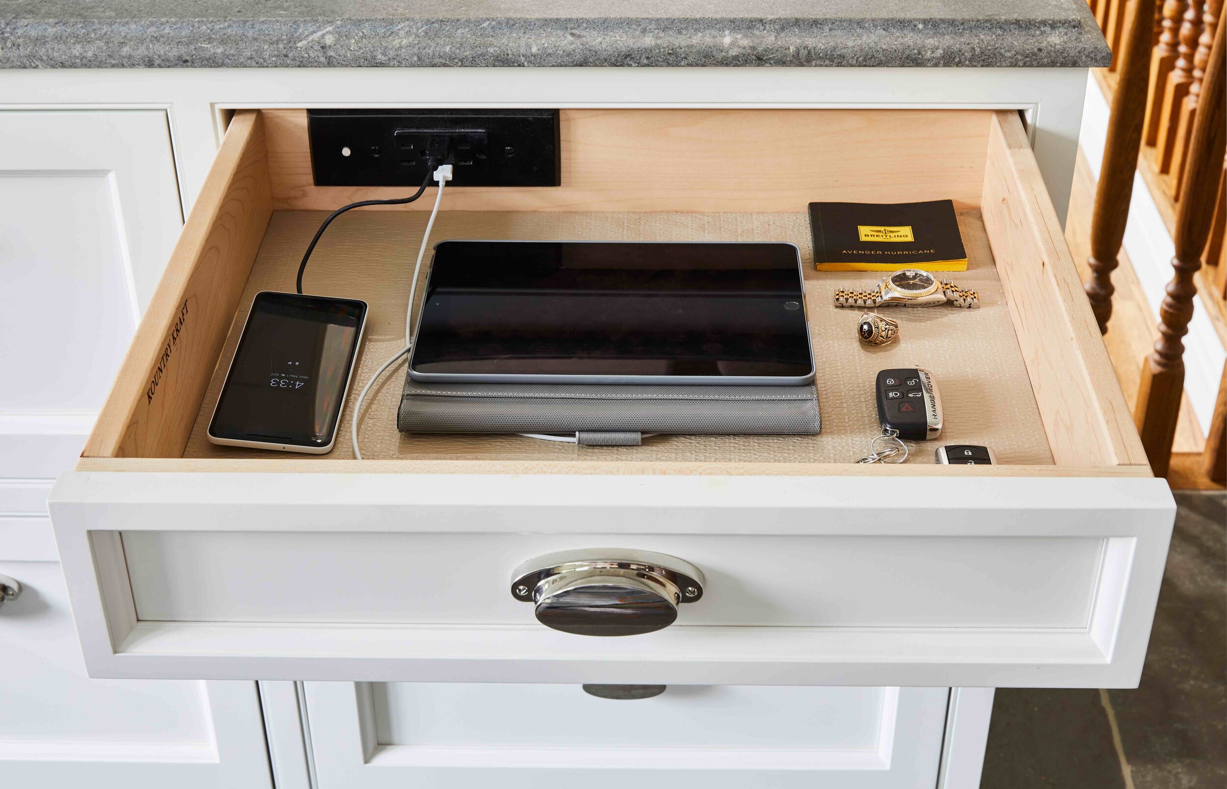
Our favorite piece of this build was actually the fridge. We wanted it to be seen as a piece of furniture, to keep from overpowering the rest of the kitchen. We built the wall first and then incorporated the fridge with the same rifted oak as the island. We incorporated a drawer just for accessories, with power outlets for the homeowners to charge phones and appliances while staying hidden. This design kept the fridge from becoming obtrusive in the kitchen, and created a balance for the space.
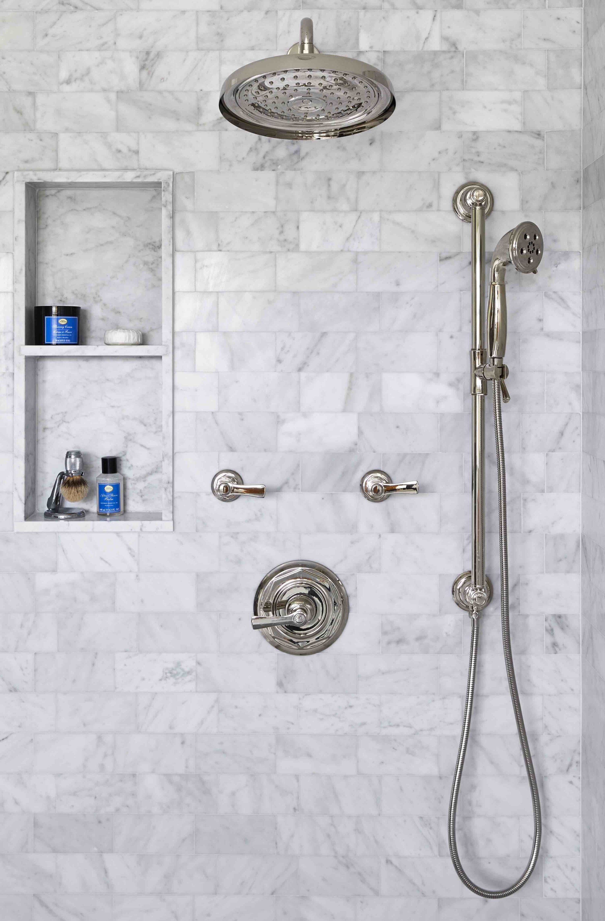
The master bathroom was also not utilizing space as well as it could, but by improving the layout, we were able to unlock the potential of this room. The toilet was the first thing you noticed when entering the room, there was little natural light, and the shower was tucked behind the door. We moved the toilet so that it could be hidden in its own room, and created a huge window as the focal piece, letting in natural light and brightening the room. We also relocated the shower, added a seat inside, and even incorporated a Jacuzzi with the shower. With our redesigned layout, we created so much space that we were able to install a beautiful 9-foot double vanity in the private room.
The project was a fantastic process, and the homeowners were simply astounded with the final result. We always love the opportunity to build something beautiful. Be sure to let us know what you think!


